


Responsive web design allows a site to be presented with an optimal viewing experience across a variety of screen sizes, such as mobile phones and tablets. Using One Page Theme or a standard themes will ensure your site is "responsive".


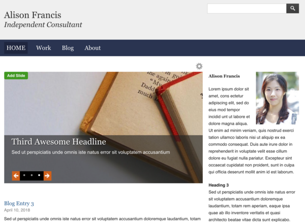
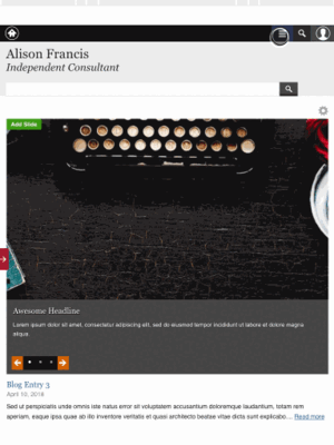
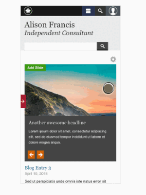
Below you will find three examples (desktop, tablet, handheld) depicting different browser sizes, all derived from the same theme.
Desktop View
Tablet View
Handheld View